Properties
When a component is selected on the canvas, the Properties panel displays the properties of that component. Component properties are categorized and displayed in tabs. The number of tabs depends on the number of editable properties of the component.
💡 Tip
- The Properties panel only displays the properties of the selected component when exactly one component is selected on the canvas. If multiple components are selected, the panel will indicate that multiple components are selected and cannot be edited.
- If no component is selected, the panel displays the canvas's property list, where you can set properties such as canvas resolution, background color, and background image.
Dynamic Display of Tabs
The Properties panel does not display all configurable property tabs at once because some tab settings depend on properties in other tabs. If these settings differ, the tabs that depend on them will also change accordingly. A typical example is when selecting a bar chart and setting the coordinate system to rectangular coordinates. In this case, the property list will show X-axis and Y-axis tabs.
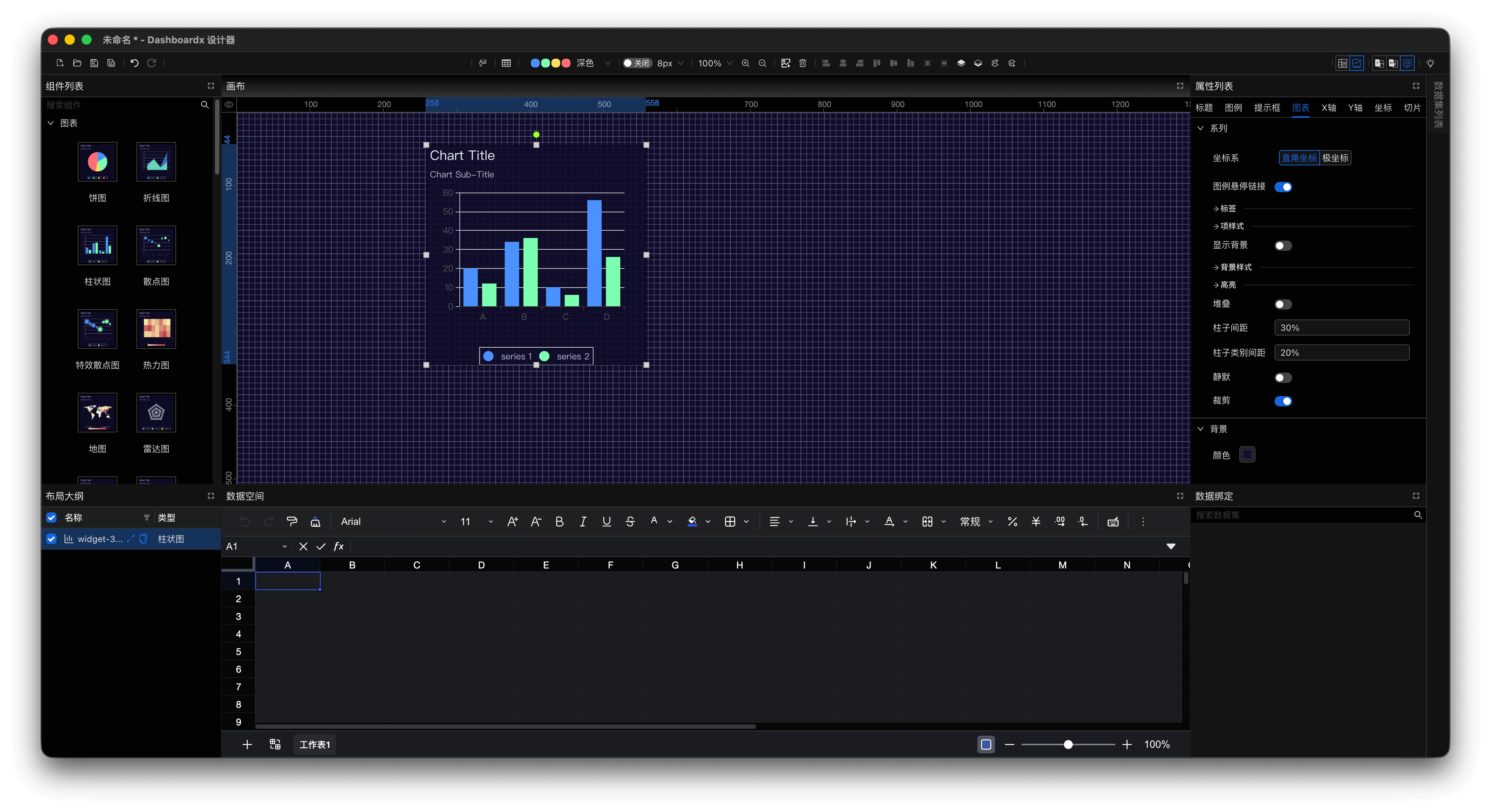
Figure 1: Properties Panel with Bar Chart Set to Rectangular Coordinates
When setting the coordinate system to polar coordinates, the property list will show Radius Axis and Angle Axis tabs.
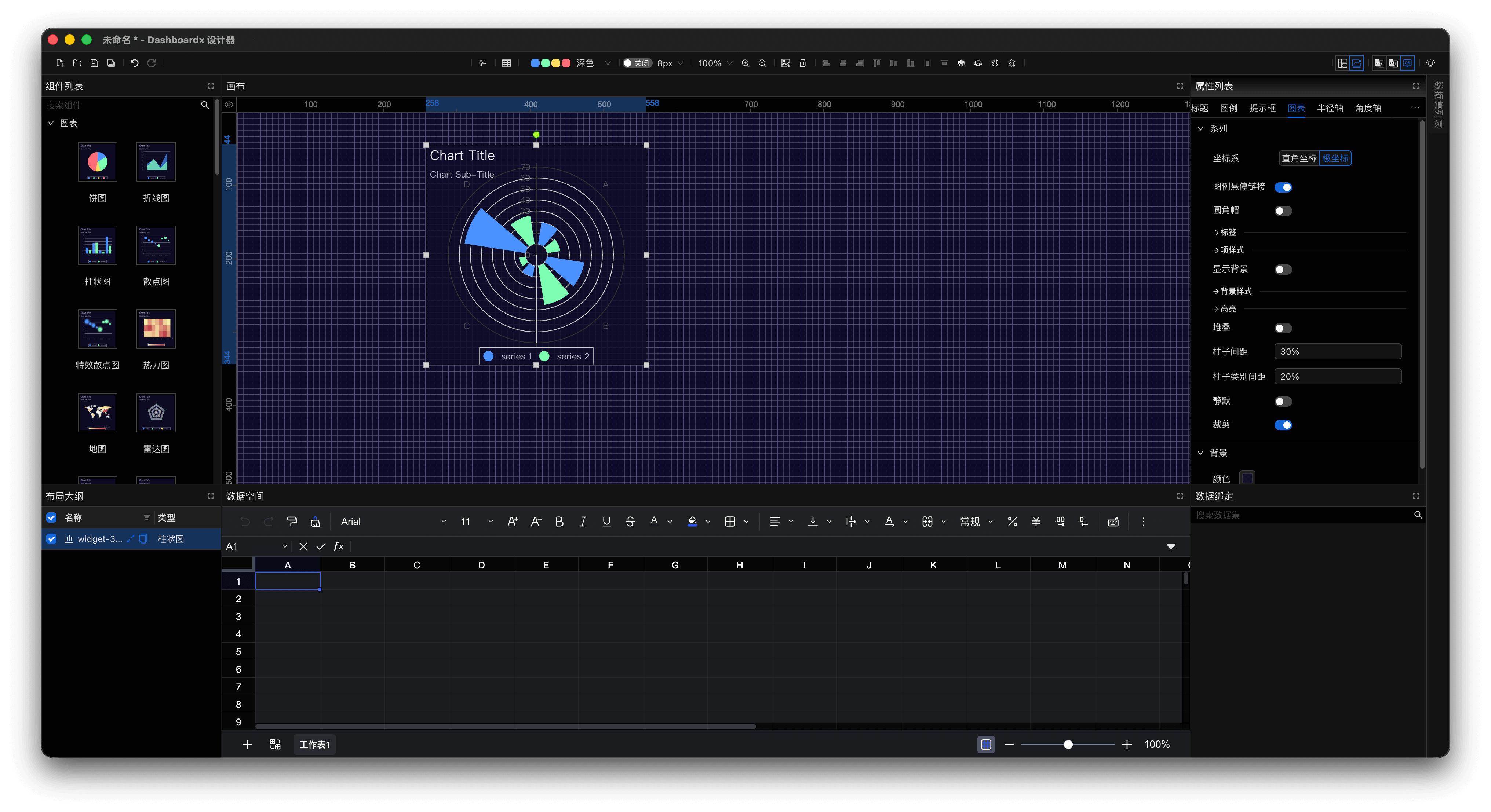
Figure 2: Properties Panel with Bar Chart Set to Polar Coordinates
Dynamic Display of Properties
Properties within the same tab are also not all displayed at once because some properties depend on the settings of other properties. If these settings differ, the properties that depend on them will also change accordingly. A typical example is when selecting a line chart, setting the coordinate system to rectangular coordinates, and selecting the Y-axis type as numerical axis. The Y-axis tab properties are as follows.
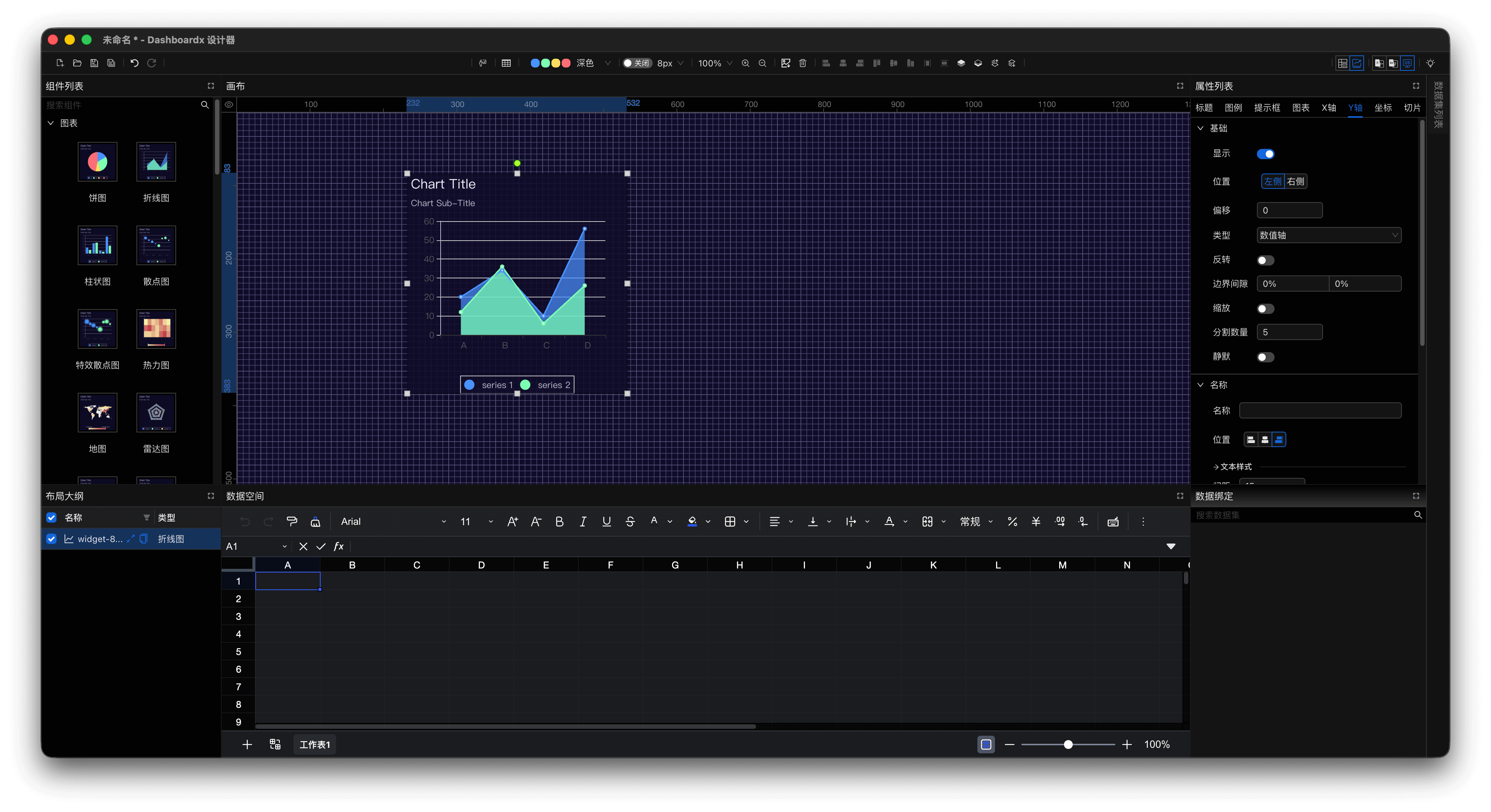
Figure 3: Y-axis Tab with Line Chart Set to Numerical Axis
When setting the Y-axis type to logarithmic axis, the Y-axis tab properties are as follows.
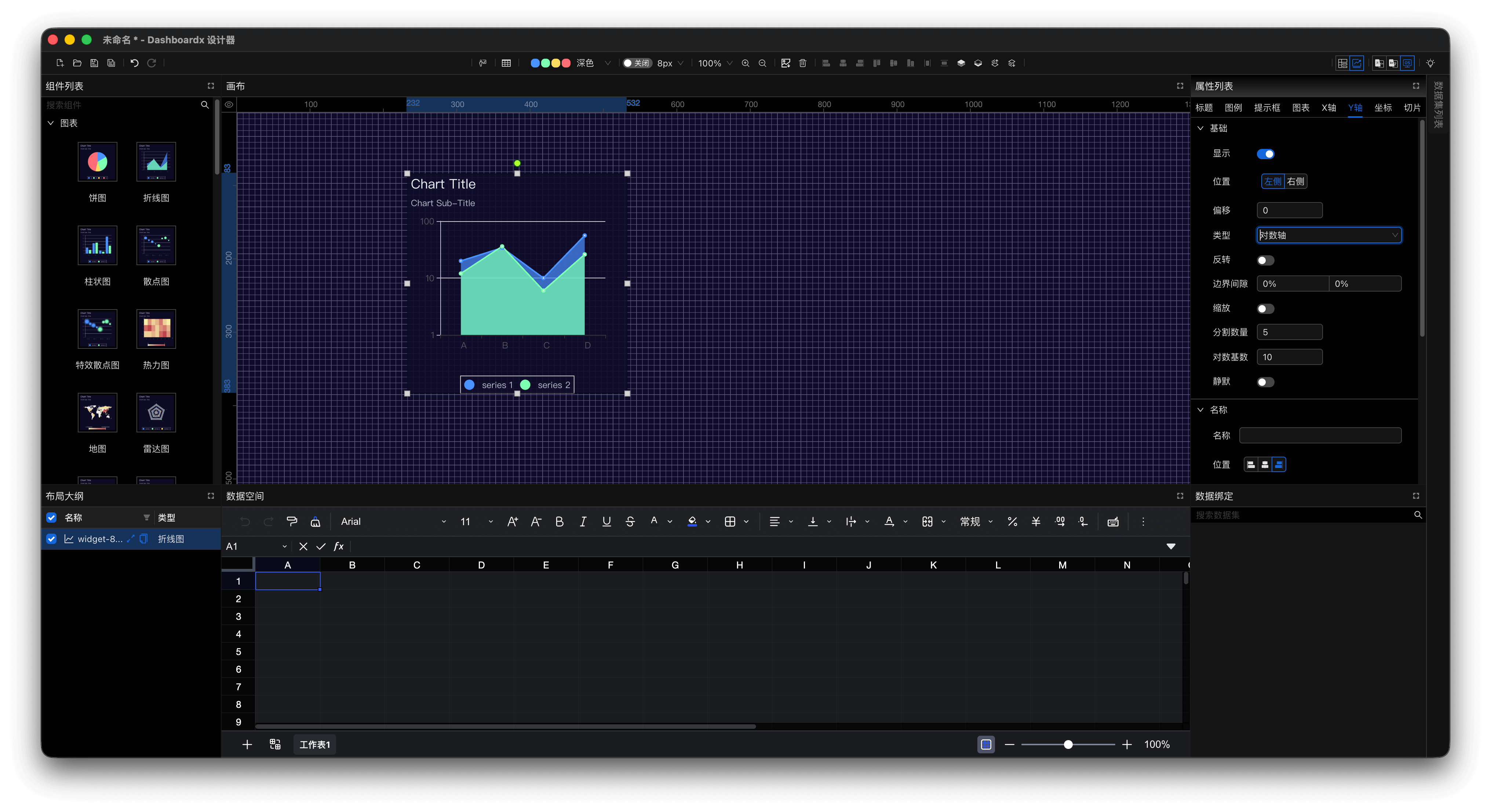
Figure 4: Y-axis Tab with Line Chart Set to Logarithmic Axis
When set to logarithmic axis, a new property logarithmic base appears.
Common Tabs
Although the number of tabs depends on the selected component, there are also some general tabs that are consistent for most components. The following lists some common tabs.
Coordinates
In this tab, set the position of the component on the canvas (top-left coordinates) as well as its width and height.
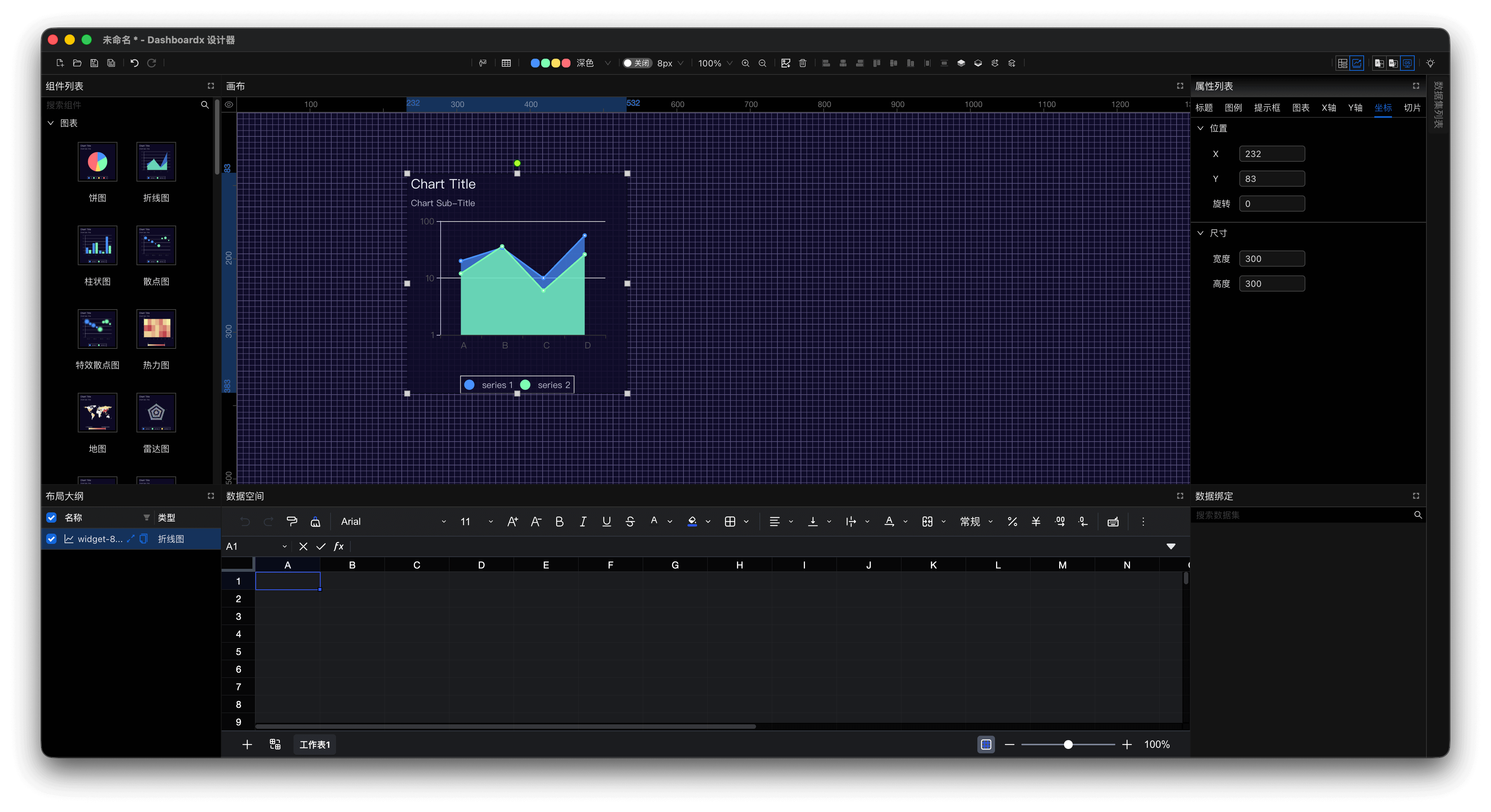
Figure 5: Coordinates Tab of Line Chart
Slice-related properties
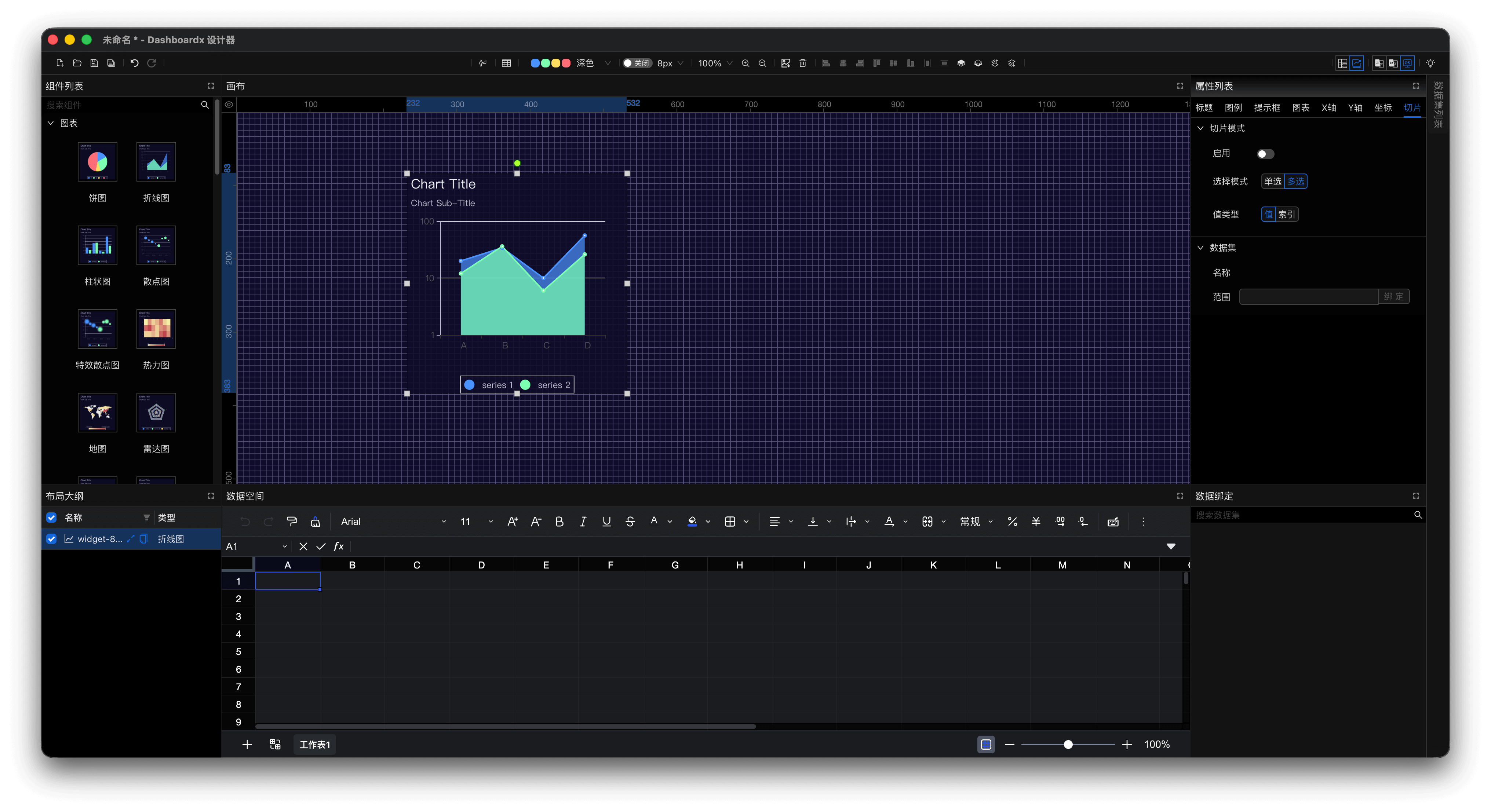
Figure 6: Slice Tab of Line Chart
Different widgets offer different slice options — the panel shows only what the selected widget actually supports. Everything to do with slicing lives in the Slice tab, under Slice Mode:
- Chart widgets — switch slicing on with Enable, then choose a Selected Mode (single or multiple) and a Value Type (value or index).
- Select, Radio, Checkbox — no enable switch and no selected mode here, only Value Type. How these widgets select is a property of the widget itself: a Select switches between single and multiple under General Settings → Controls → Mode, a Radio is single-select by nature, and a Checkbox is multi-select.
- Number Input, Date Picker, Slider — nothing to enumerate, so there is no selected mode and the only value type is Value. The widget writes what you type, or the range you drag, into its slice area.
If a widget does not support slicing at all — a KPI card, for example — the Slice tab does not appear.
Best practices
The default settings cover most situations and often need no adjustment at all. When something does need changing, the widget's own documentation explains what each option does.
Where to go next
- Widgets — widget types, including KPI
- Data Slice — how slicing behaves and what to expect
- Canvas — canvas properties, shown here when nothing is selected