Quick Start
Welcome to Dashboardx Designer! This guide will help you quickly create your first dashboard.
💡 Tip
This chapter demonstrates through a simple example how to transform visual datasets in the data space into visual charts and generate dashboards. The dashboard in this example has limited display capabilities, with the purpose of demonstrating how to use Dashboardx Designer. Through the design implementation methods demonstrated in the example, you can design dashboards with rich presentation capabilities.
Before You Begin
System Requirements
Dashboardx Designer is currently available for macOS and Windows:
macOS
- Operating System: macOS 12.0 (Monterey) or later
- Processor: Apple Silicon
- Memory: Minimum 8 GB RAM, recommended 16 GB
- Storage Space: 500 MB available space
- Display: 1280 × 800 resolution or higher
Windows
- Operating System: Windows 10 or later (Windows 11 recommended)
- Processor: Intel Core i5+ or equivalent AMD processor
- Memory: Minimum 8 GB RAM, recommended 16 GB
- Storage Space: 500 MB available space
- Display: 1280 × 800 resolution or higher
What You Need to Prepare
- Data to Visualize: This example uses data from the United Nations Department of Economic and Social Affairs, Population Division's "World Population Prospects 2024". Data download address: World Population Prospects 2024 Data
- Basic Understanding of Data Structure
- Approximately 15-20 Minutes of Time
Install Dashboardx Designer
macOS Users
- Open Mac App Store on your computer
- Search for "Dashboardx Designer"
- Click the "Get" button to download and install
- Wait for installation to complete (approximately 2-3 minutes)
Windows Users
- Open Microsoft Store on your computer
- Search for "Dashboardx Designer"
- Click the "Get" or "Install" button to download and install
- Wait for installation to complete (approximately 2-3 minutes)
Step 1: Launch and Explore
Launch Dashboardx Designer from the "Applications" folder or Launchpad
Data Perspective: After opening the application, the data perspective is displayed, containing the following views and panels:
- Data Space View: Used to display and manage data, with its own independent toolbar. In this view, you can enter, analyze, and design data just like using Excel, WPS Spreadsheets, or other spreadsheet applications. For datasets that need visual presentation, select this part of the data and use the "Create Dataset" button on the global toolbar to create datasets.
- Dataset List Panel: Created datasets are displayed in this panel. You can view, update, and delete datasets. If components perform slice operations and bind slice datasets, slice datasets generated by components will also be displayed here.
Quick Tour (Recommended for first-time users): Click the "💡" icon in the top-right corner of the toolbar, and the application will enter guided tour mode. You can gradually explore the functions of each part in the data perspective according to the prompts in the guide dialog.
Step 2: Data Preparation and Modeling
- Open the prepared data using Excel or WPS Spreadsheets. In the workbook, select the
Estimatesworksheet, filterChinain theRegion, subregion, country or areacolumn to get Chinese population data. Copy the four columns of data:Year,Total Population, as of 1 July (thousands),Male Population, as of 1 July (thousands), andFemale Population, as of 1 July (thousands)to the data space. Rename each column as "Year", "Total Population (Unit: Thousand)", "Male Population (Unit: Thousand)", and "Female Population (Unit: Thousand)" respectively. The result is shown in Figure 1.
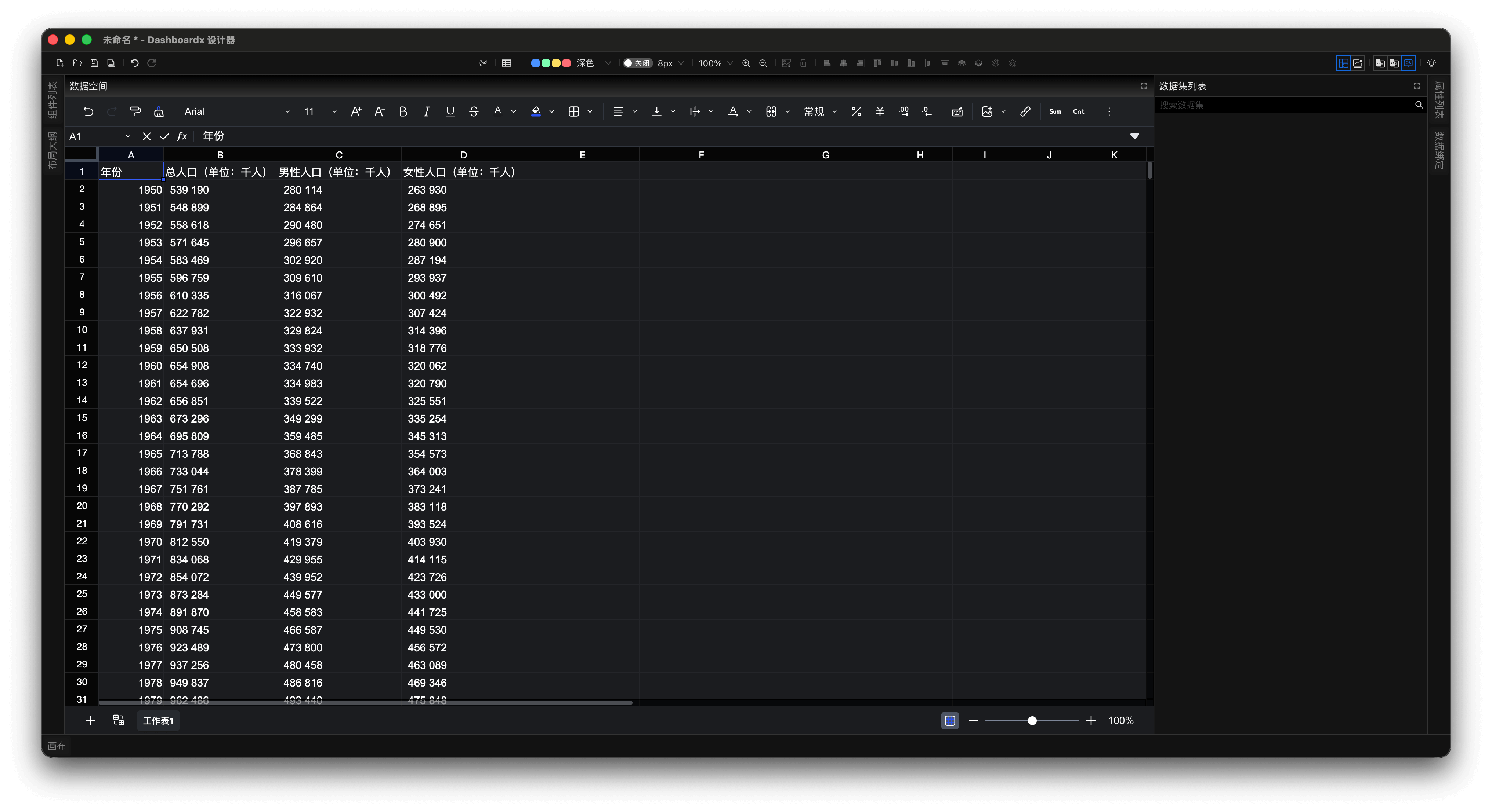
Figure 1: Copy and Organize Chinese Population Data to Data Space
- The copied population data are all in text format because the data uses spaces as thousands separators. We can use the spreadsheet formula
=--SUBSTITUTE(cell," ","")for data conversion. Here, we keep the original copied data, and the converted data is shown in Figure 2.
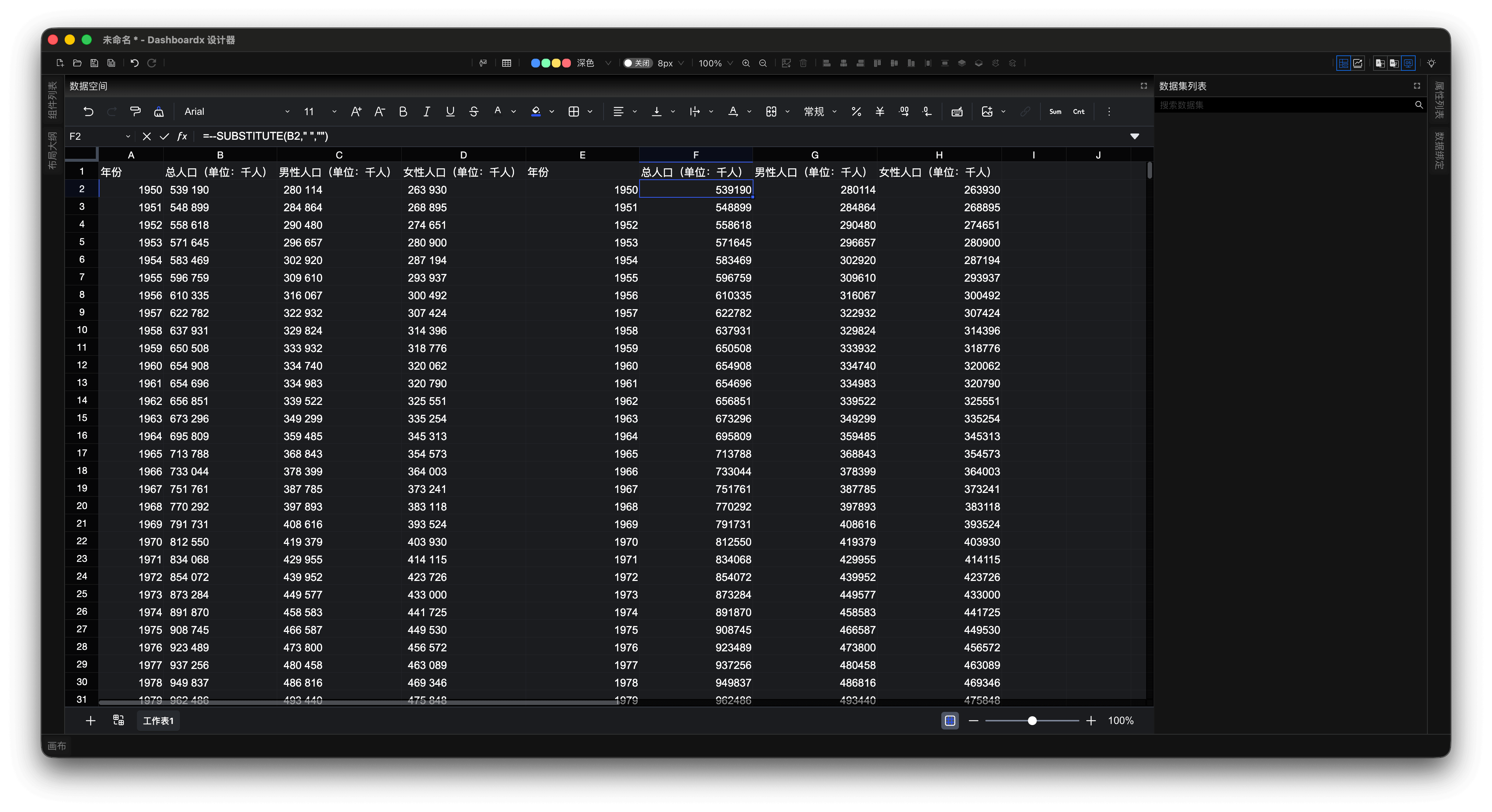
Figure 2: Use Formula to Convert Text Data to Numeric Data
- In the data space, select the converted data, click the "Create Dataset" button on the toolbar to create the "Chinese Population Statistics Over Years" dataset, as shown in Figures 3 and 4.
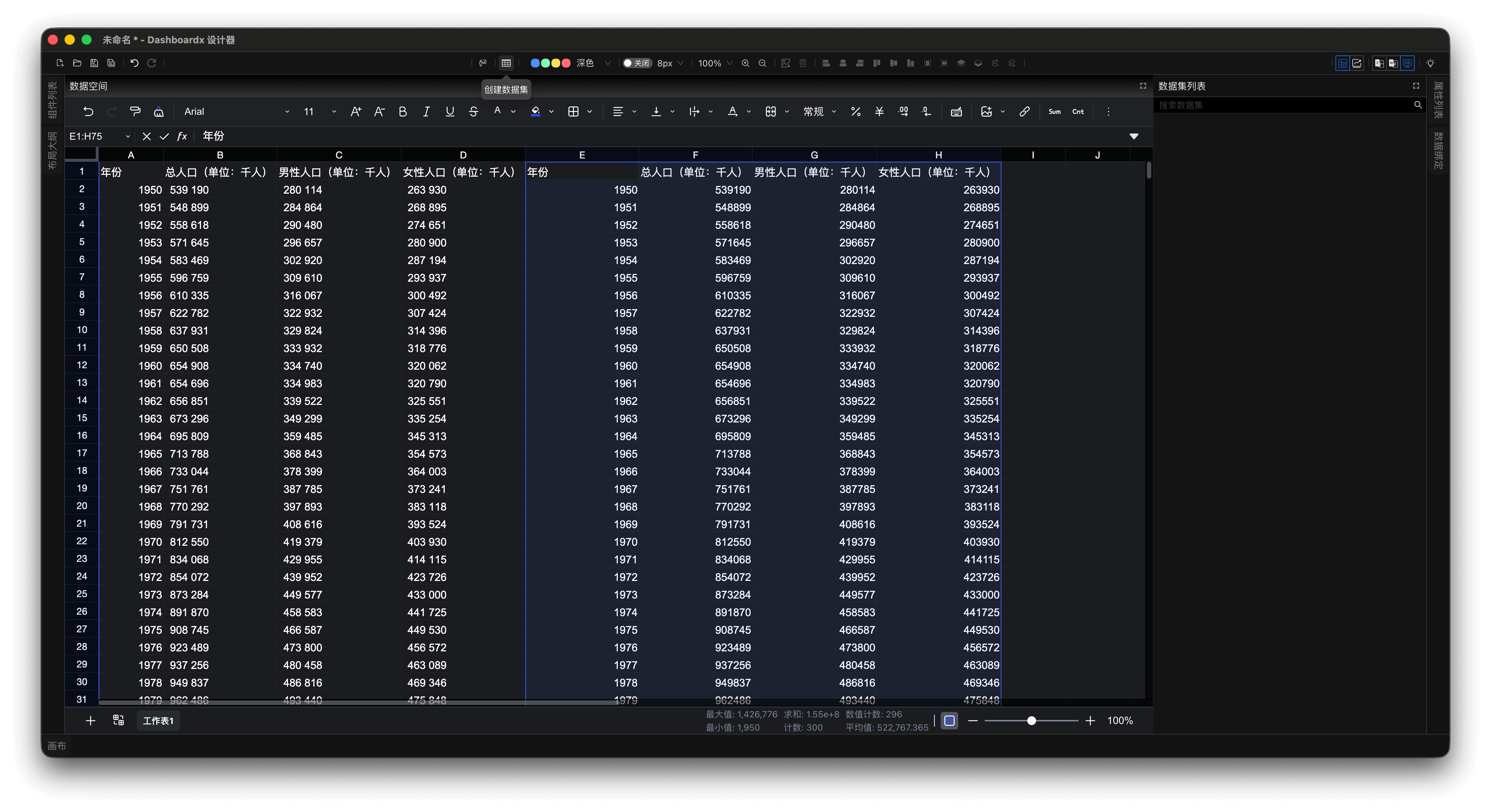
Figure 3: Select Converted Data to Prepare for Creating Dataset
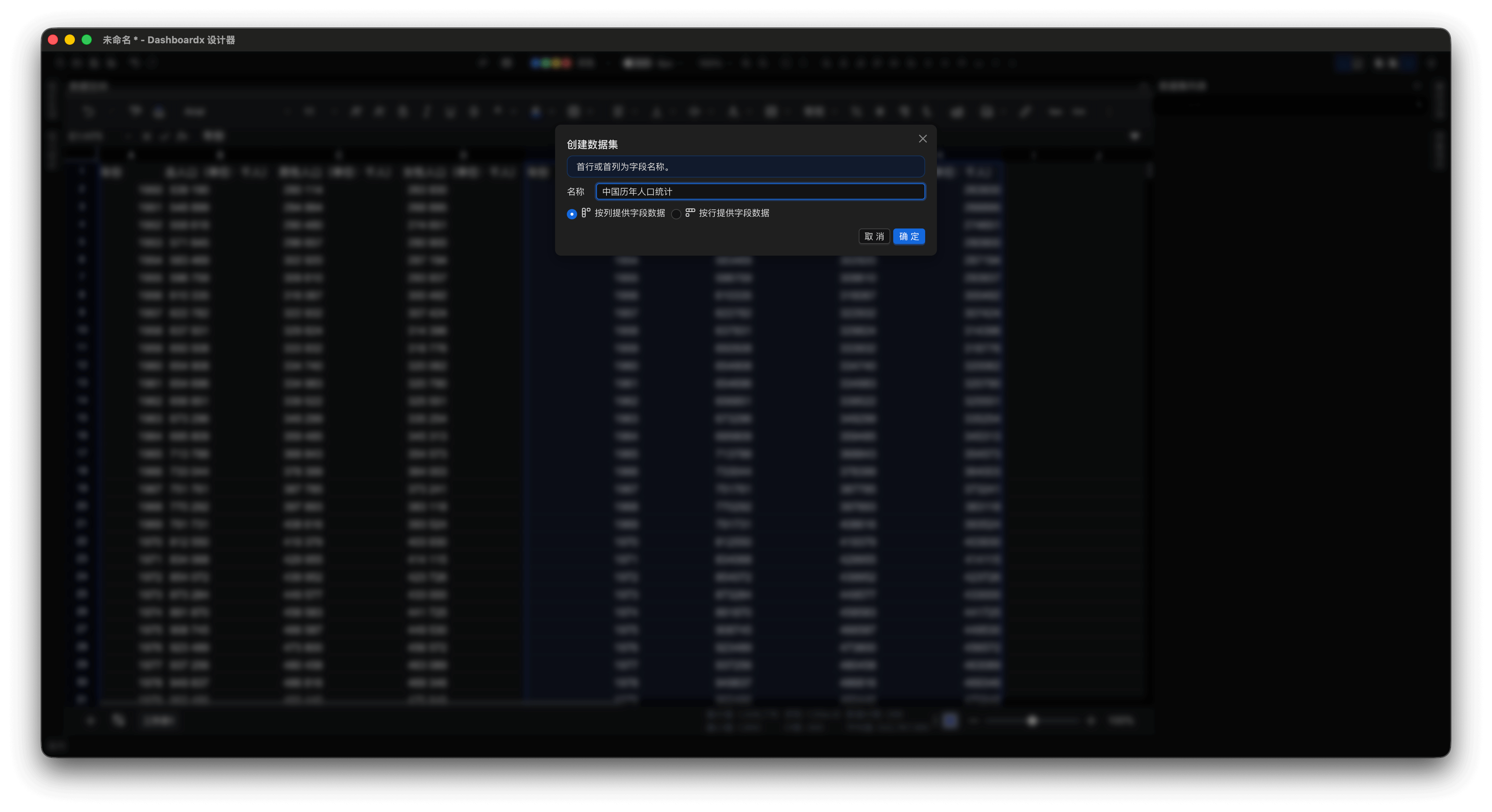
Figure 4: Create "Chinese Population Statistics Over Years" Dataset
After creation, the "Chinese Population Statistics Over Years" dataset will be displayed in the Dataset List panel, as shown in Figure 5.
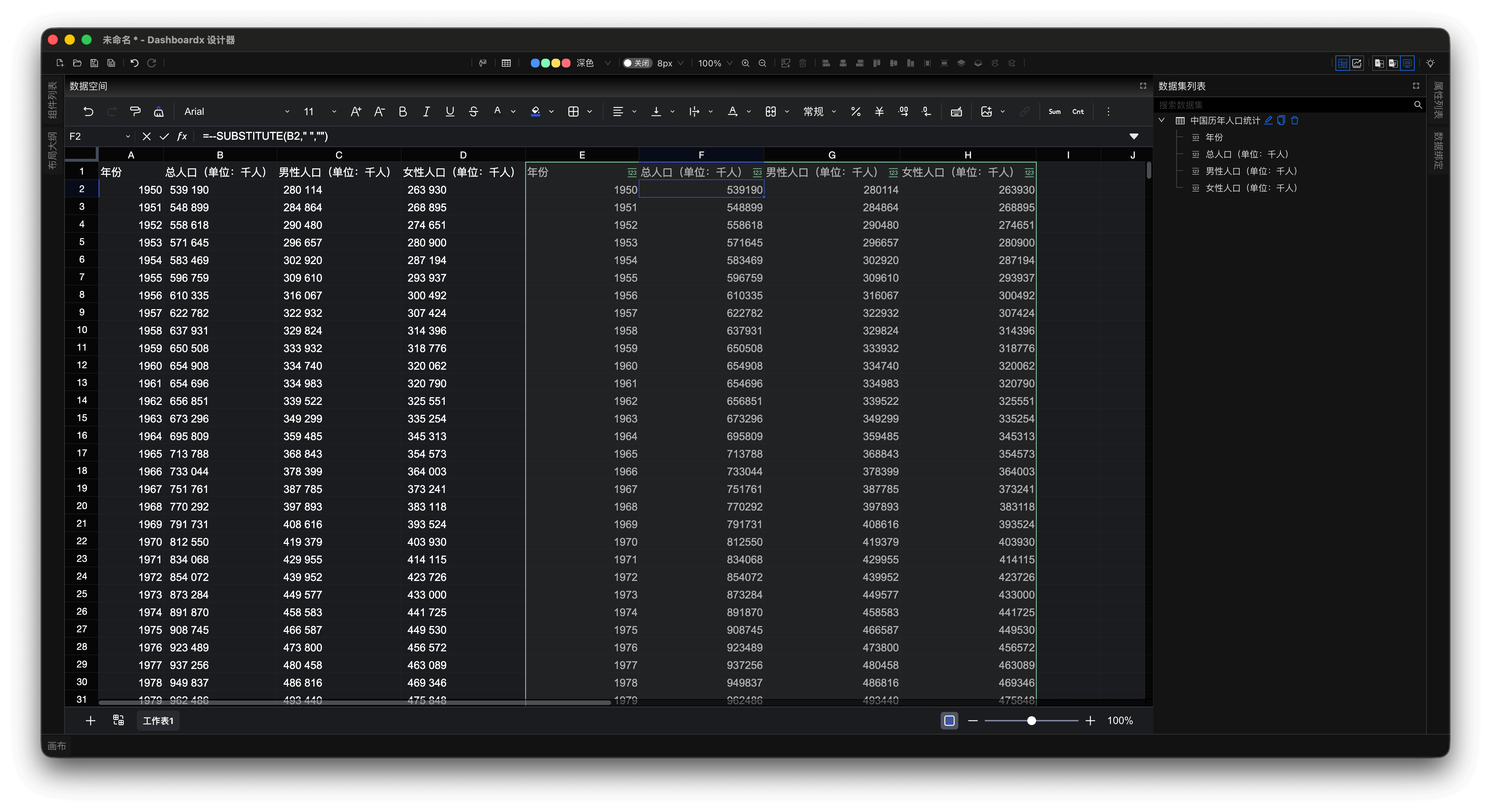
Figure 5: "Chinese Population Statistics Over Years" Dataset in Dataset List Panel
Step 3: Data Visualization
- Click the "Design Perspective" button on the toolbar to switch from the data perspective to the design perspective.
💡 Tip
Quick Tour (Recommended for first-time users): Click the "💡" icon in the top-right corner of the toolbar, and the application will enter guided tour mode. You can gradually explore the functions of each part in the design perspective according to the prompts in the guide dialog.
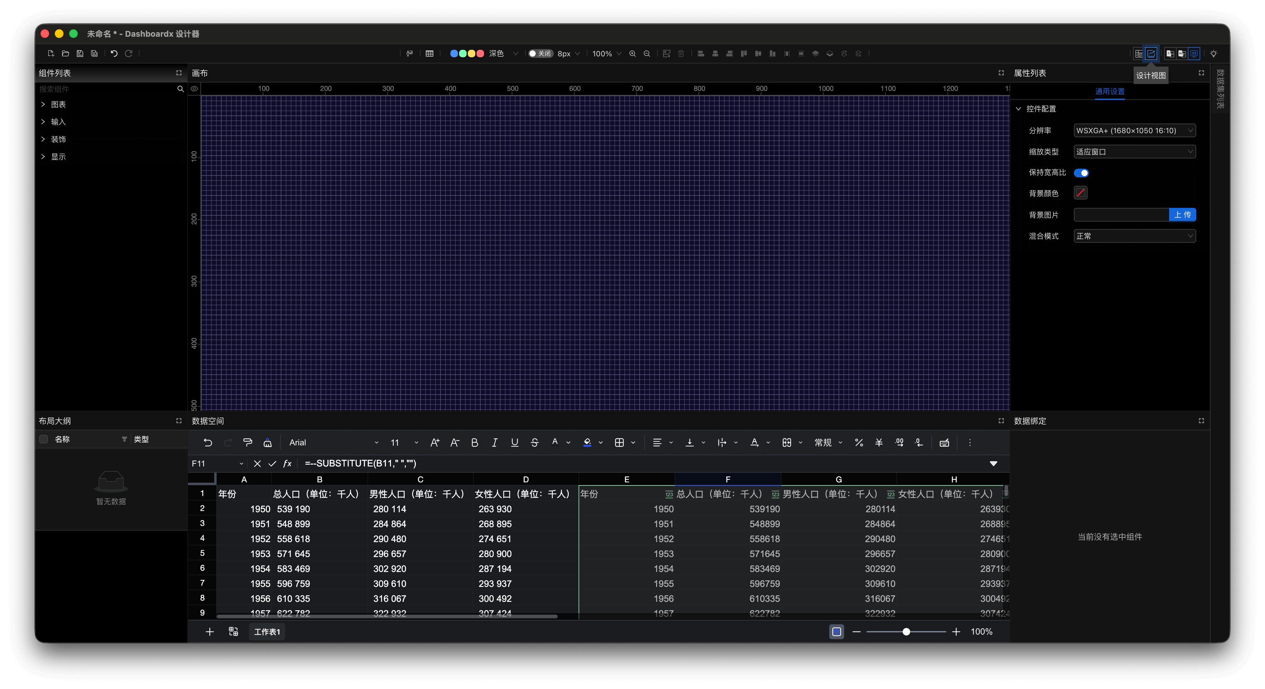
Figure 6: Switch to Design Perspective
- Drag the "Line Chart" component from the Component List panel onto the canvas. After dragging, appropriately adjust the width and height of the line chart on the canvas. The Property List panel displays the property list of the "Line Chart", and the Data Binding panel displays the list of currently bindable datasets.
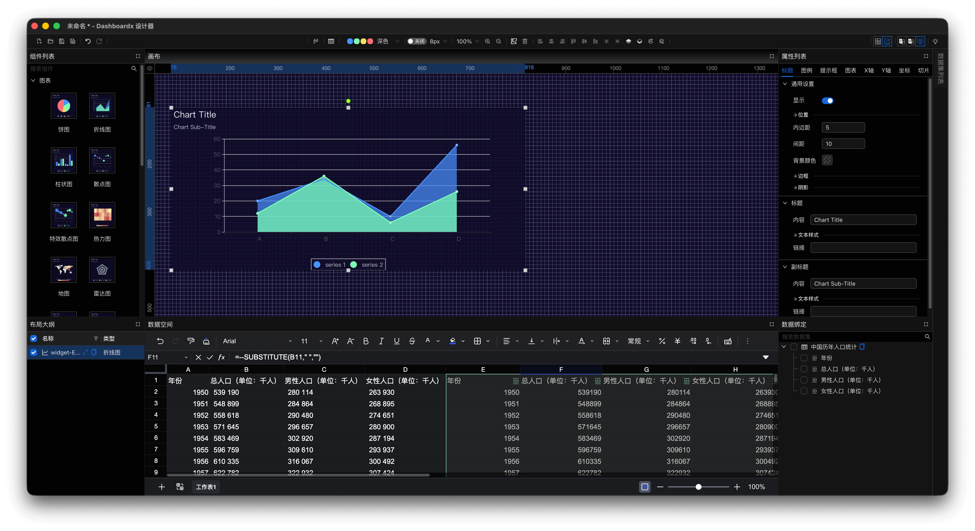
Figure 7: Drag Line Chart Component to Canvas
- In the Data Binding panel, sequentially select
YearandPopulation (Unit: Thousand), and the application will automatically complete data binding based on the selected data.
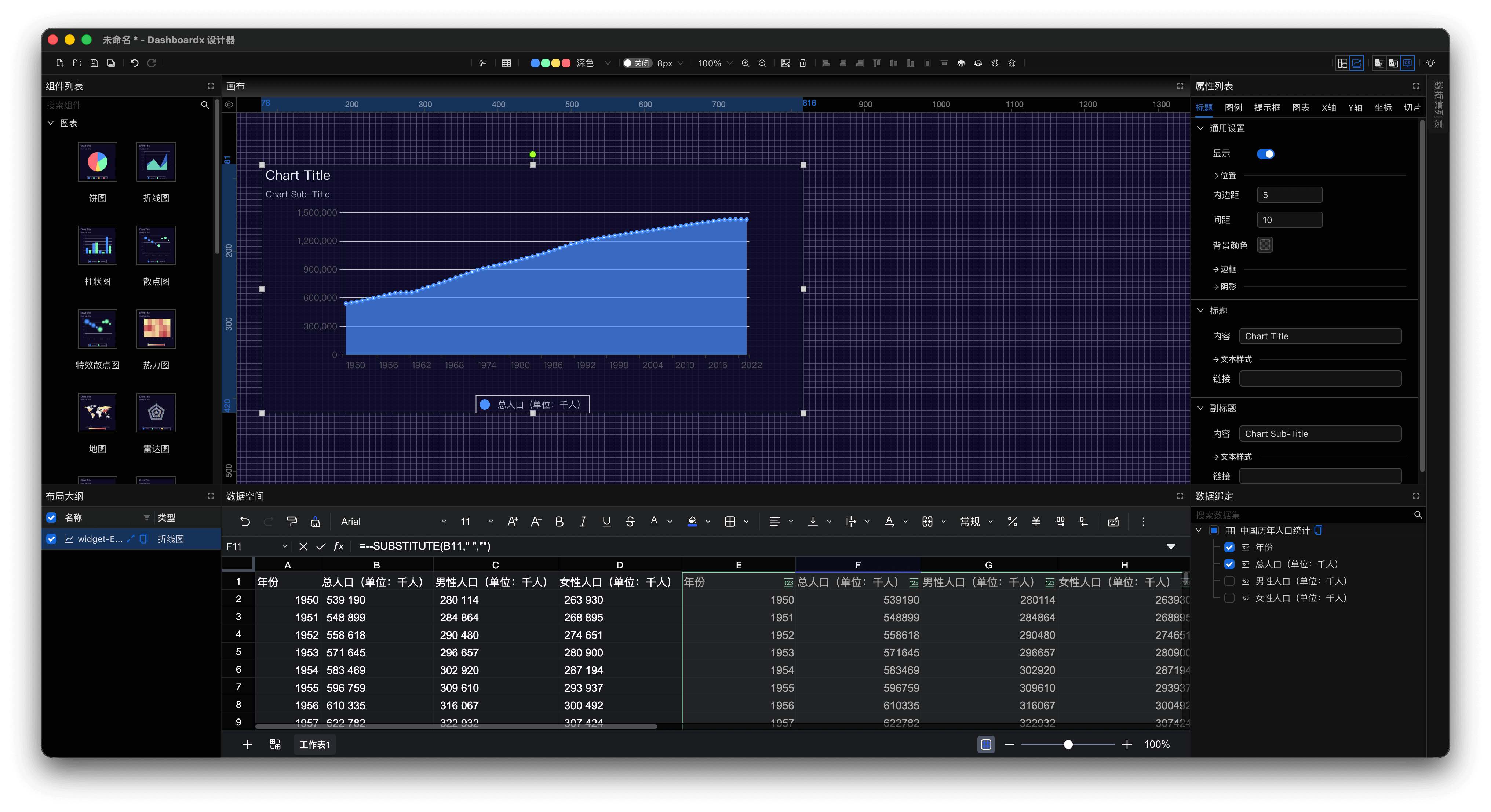
Figure 8: Complete Data Binding
- In the
Titletab of the Property List panel, change the title of the line chart toChinese Population Statistics Over Years, change the subtitle to1950-2023, and set the title position to horizontal center.
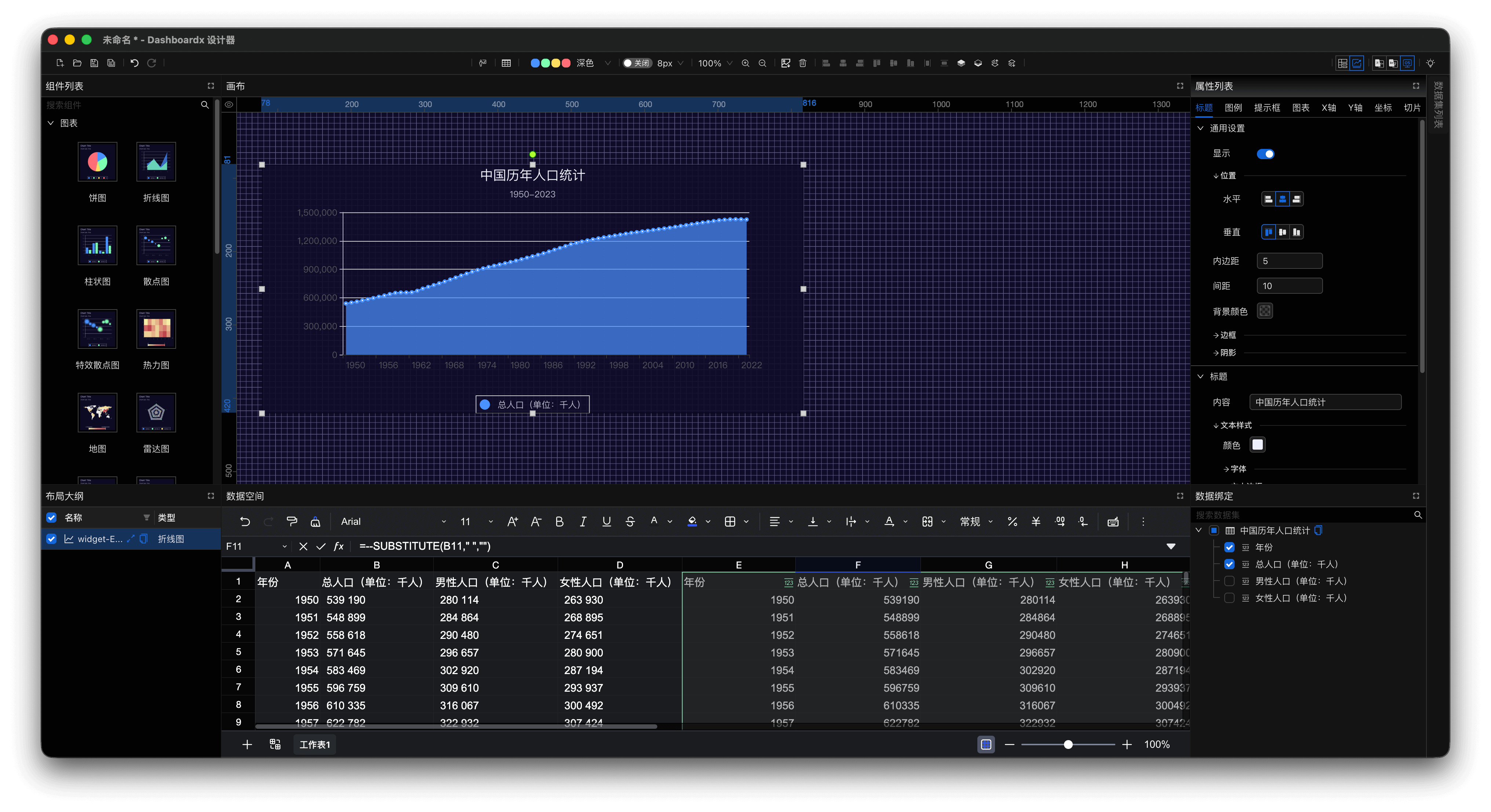
Figure 9: Modify Title Properties
Step 4: Create Slice
- In the Property List panel, select the
Slicetab, click theEnable Slicebutton, change the selection mode toSingle Selection, and change the value type toIndex.
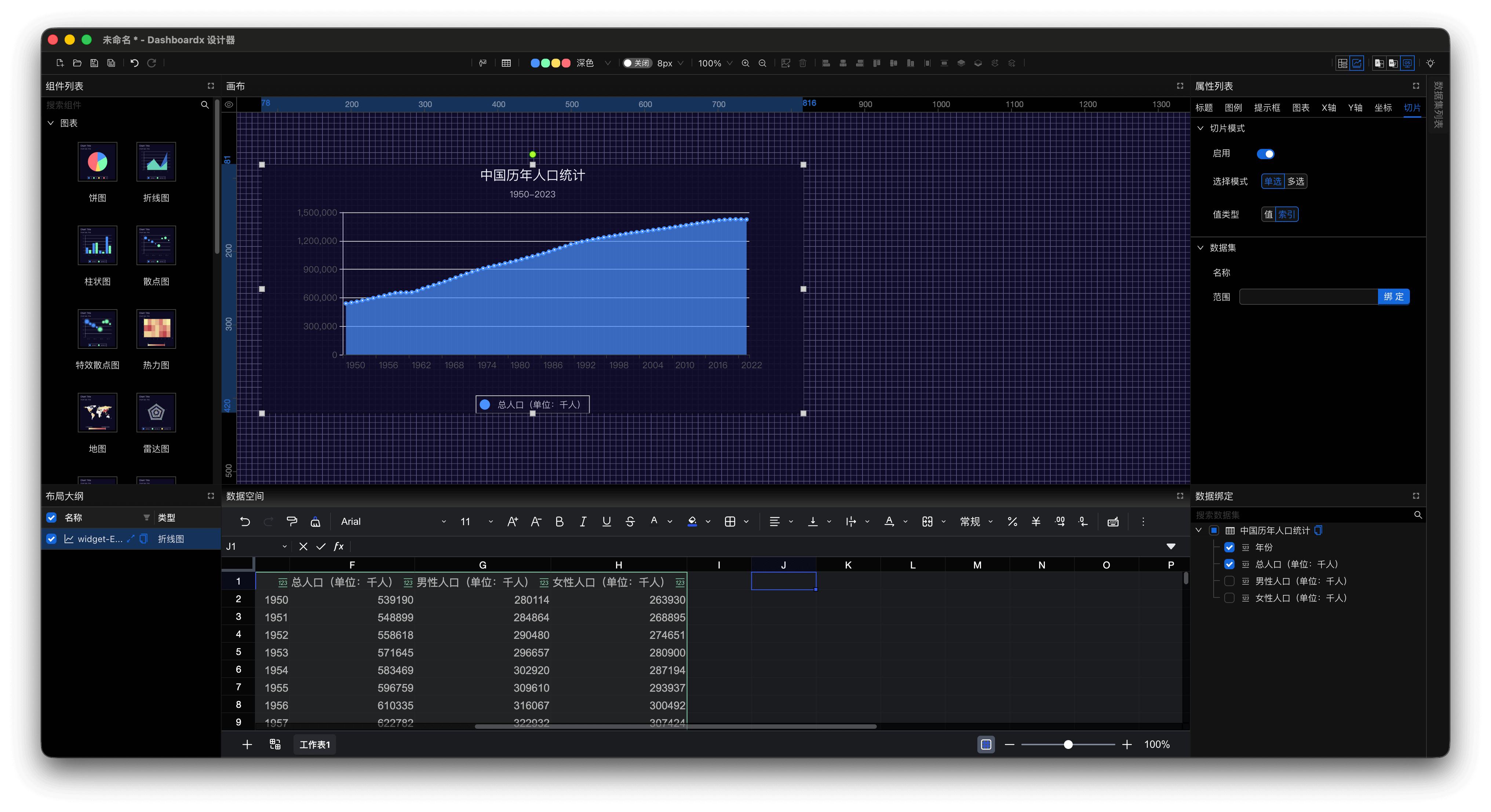
Figure 10: Enable Slice and Configure Mode
- Click the
Bindbutton on the range input item to create a slice dataset. After selecting the binding range, click theConfirmbutton.
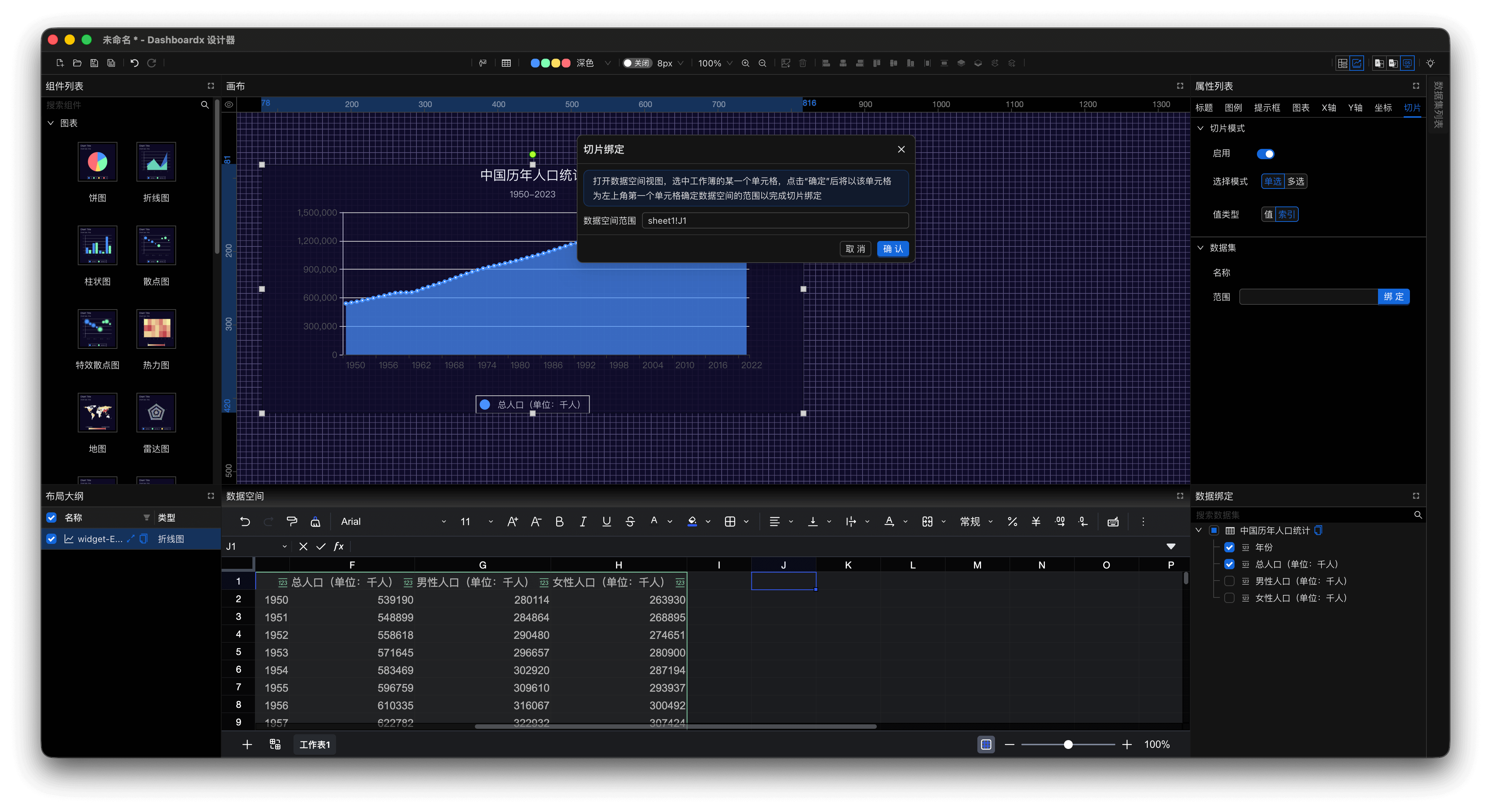
Figure 11: Bind Range and Create Slice Dataset
- Click on a certain year's data on the line chart to see changes in the slice dataset data.
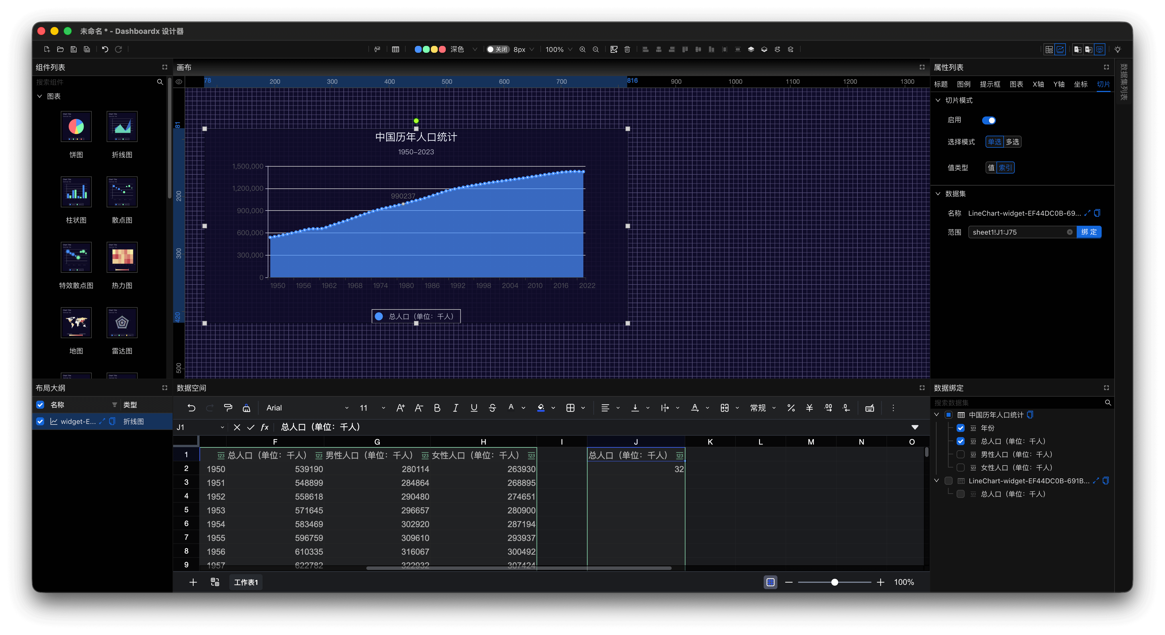
Figure 12: Click Year Data to View Slice Changes
Step 5: Create Related Dataset
- Click the
Maximize Viewbutton in the top-right corner of the data space view. Use the spreadsheet formula=INDEX(E2:E75, $J$2, 1)to get the selected year, and similarly getMale Population (Unit: Thousand)andFemale Population (Unit: Thousand).
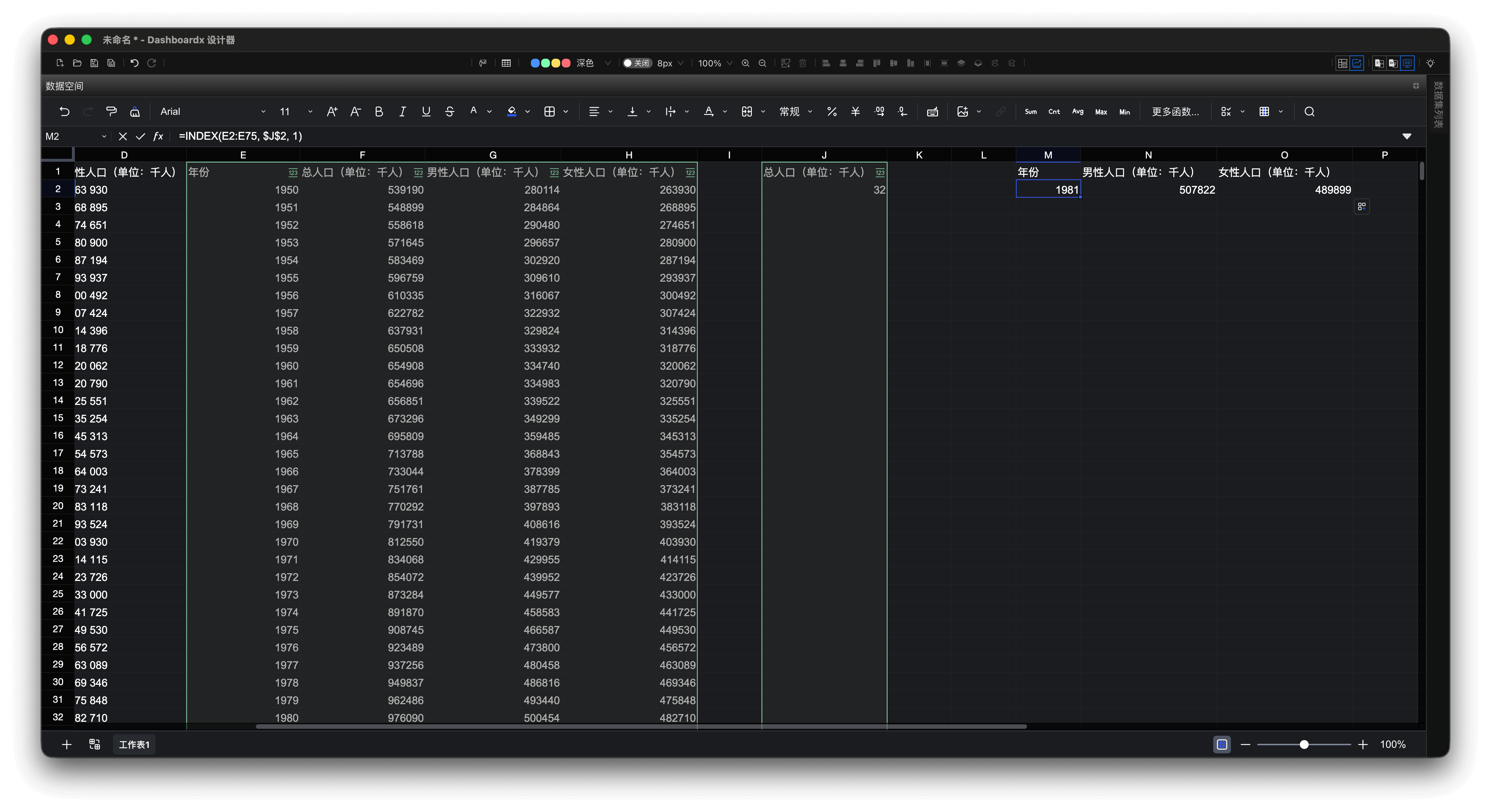
Figure 13: Use INDEX Formula to Get Selected Year Data
- Select the three data fields obtained above to create the dataset
Selected Year Population Distribution. Note that here we change the data provision method toProvide Field Data by Row.
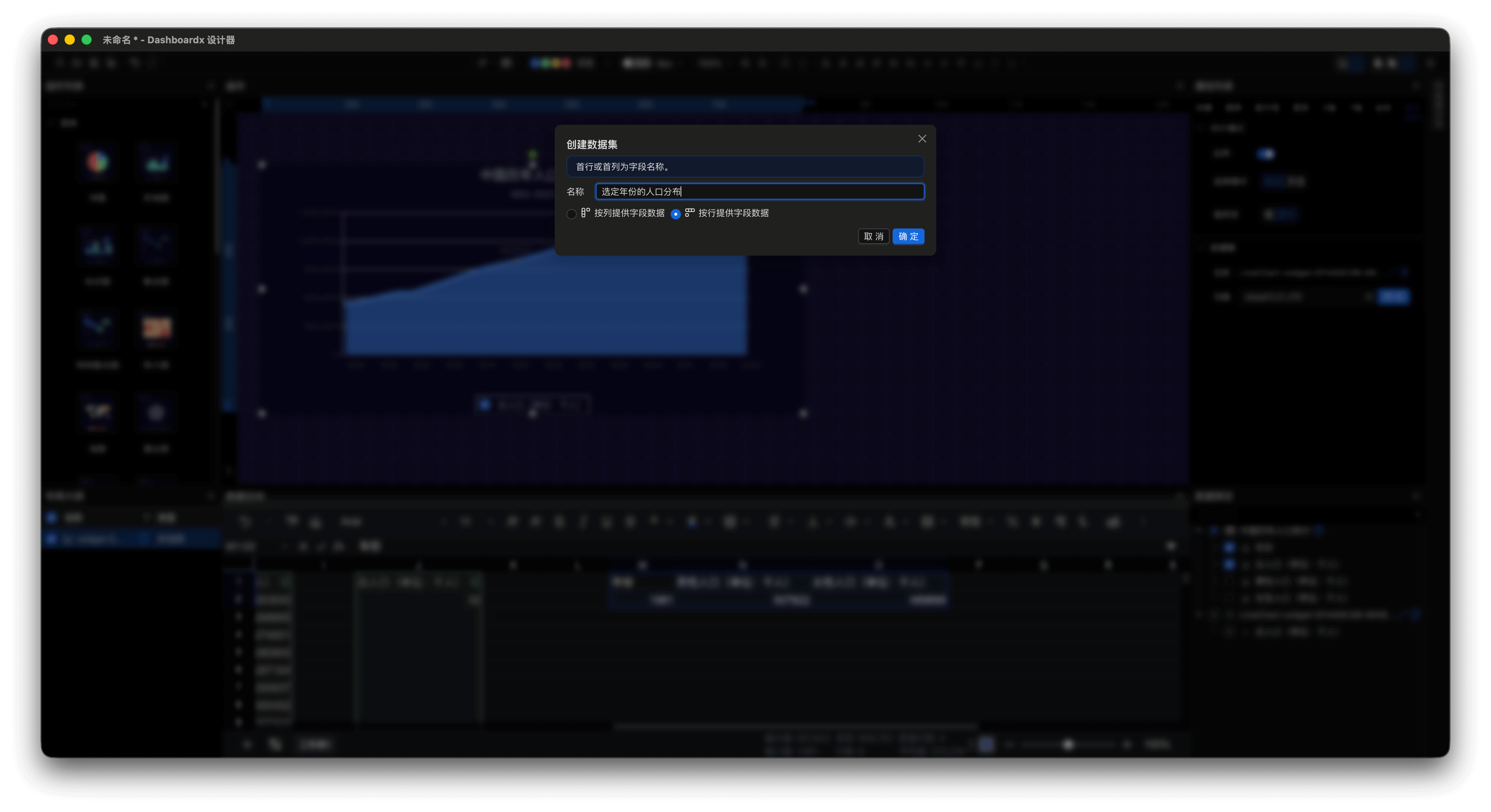
Figure 14: Create "Selected Year Population Distribution" Dataset
Step 6: Related Dataset Visualization
- Drag the
Pie Chartcomponent from the Component List panel onto the canvas and appropriately adjust its width and height. In the Data Binding panel, check the checkbox in front of theSelected Year Population Distributiondataset, and the application automatically completes data binding. Change the title of the pie chart to"Selected Year Population Distribution", set the position to horizontal center, and delete the subtitle.
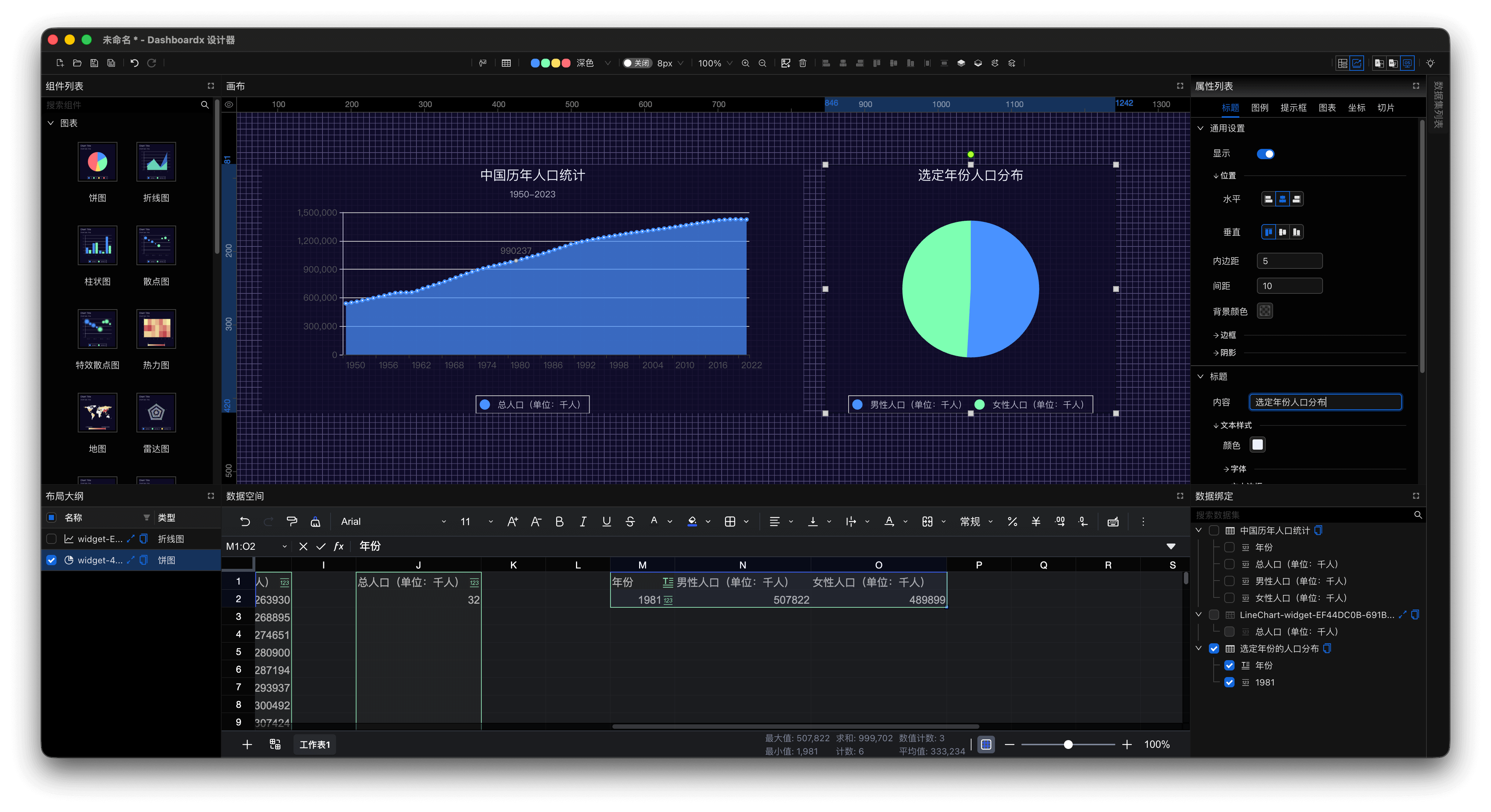
Figure 15: Drag Pie Chart Component and Bind Data
- Click on data from different years on the line chart, and you can see the pie chart updating in real time, truly reflecting changes in population distribution for the selected year.
Step 7: Visual Presentation
- Click the "Presentation" button on the global toolbar for visual dashboard presentation and interaction.
- Use the keyboard shortcut
Cmd + Tto exit presentation mode.
Step 8: Save and Export
- Local Save:
- Select File > Save (⌘S)
- Choose storage location and enter filename
- File format:
.dxf(proprietary format)
Step 9: Share Your Dashboard
- Email: Directly attach saved files.
- Cloud Storage: Upload to iCloud, Baidu Netdisk, etc.
- Presentation Perspective: Present directly from the application.
Success Tips
Best Practices
- Start Simple: Start with 3-4 key components, then gradually expand.
- Consistent Design: Use the same colors, fonts, and styles throughout the dashboard. When customizing components, try to maintain consistency with the selected visualization theme.
- Clear Labels: Ensure every element has clear labels.
- Performance Optimization: For best performance, it is recommended to keep datasets within 10,000 rows.
Time-Saving Shortcuts
- ⌘N: New Dashboard
- ⌘O: Open Dashboard
- ⌘S: Save
- ⌘Z: Undo
- ⌘⇧Z: Redo
- ⌘C: Copy selected component (when canvas is selected)
- ⌘V: Paste selected component (when canvas is selected)
The best way to learn is through practice. Don't be afraid to try different components, data bindings, and design options. Each dashboard you create will bring new insights.
Happy dashboard designing! 🚀